
An experiment using CMYK pigments
Aim:
To see if the “printing process” pigments Cyan/Magenta/Yellow/Black (CMYK) are useful for painting pictures.
Background:
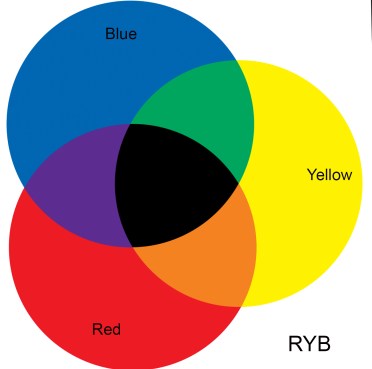
Artists are taught that the primary pigment colours are Red, Yellow and Blue (RYB).
Using this subtractive colour system, Greens are made by mixing Yellow and Blue; Purples and Violets by mixing Red and Blue; and Orange by mixing Red and Yellow (as shown below):
However, the printing trade and domestic inkjet printers use the Cyan/Magenta/Yellow/Black (CMYK) subtractive system for ink printing on paper.

So where do the CMYK colours come from and why are they used for printing?
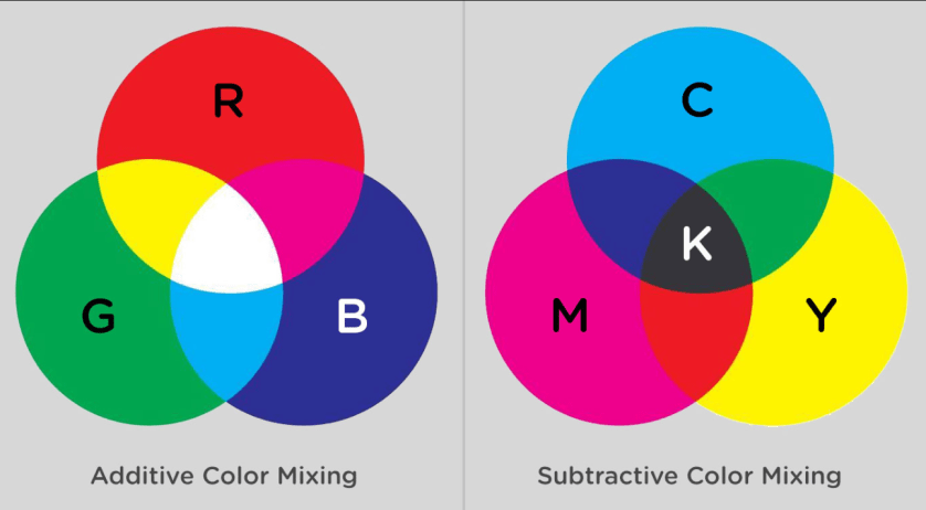
I find that these colours come from mixing the primary colours in the additive coloured light system. The primary colours in the additive system are Red, Green and Blue (the three colours that the cones in the retinas of our eyes react to). Cyan, Magenta and Yellow are the secondary colours produced by mixing these coloured lights in pairs (see diagram below left):
Green light + Blue light gives Cyan;
Red light + Blue light gives Magenta.
Red light + Green light gives Yellow; and
Note that because they are the combination of two light sources the secondary colours are brighter than the primaries.
In contrast, mixing pigments is a subtractive process (pigments absorb the light that they do not reflect) and is the opposite of the additive light system.
So mixing pigments using the additive secondaries (Cyan, Magenta and Yellow) re-creates the Red, Green and Blue additive primary colours, as shown below, right:
Mixed in various proportions, these CMYK pigments give a wide range (gamut) of colours – as seen with printed books & magazines and domestic printers that use Cyan/Magenta/Yellow plus Black (K = Black in printer-speak) to produce beautiful full colour photographs.
RYB versus CMYK:
So why do artists use the RYB system rather than the CMYK system for paintings?
There seem to be several reasons:
- Many of the pigments artists use have been around for centuries and this history sets a powerful precedent. In comparison, good CMYK pigments are comparatively new.
- The CMYK pigments are semi-transparent (such as Process Cyan) or transparent (such as Process Magenta and Process Yellow) and lack the useful quality of opacity liked by artists. (However, if used thickly or mixed with black or white they look opaque.)
- Until recently the CMYK pigments used to have poor lightfastness (we all remember the fading of printed posters in shop windows) – but Winsor and Newton now supply CMYK pigments which have good permanence and lightfastness (see below).
- With normal artists’ pigments there is a huge variety of natural and pre-blended transparent and opaque colours available.
So are there any advantages in painting with CMYK? The following seem to be the major ones:
- Simplicity – you can achieve just about any colour you want without having to have a box containing numerous paints.
Using a restricted palette with the RYB system would seem to achieve something similar at first sight. But Red, Yellow, and Blue are not well-spaced around a perceptually uniform colour wheel that includes the entire spectrum of colours. So using Red, Yellow, and Blue as primaries yields a relatively smaller range of colours.
- As Cyan Magenta and Yellow are the secondaries in the additive colour system they are brighter than the additive primaries (light beams are additive in intensity). The subtractive pigment system tends to darken colours when mixed (hence the term “subtractive”) so starting with brighter colours is an advantage. (Printers are well aware of this effect as, despite their best efforts using halftoning (printing of tiny dots), considerable overlap of the dots does occur which darkens the image, and CMYK pigments help to alleviate this effect.)
So, I decided to give painting with CMYK pigments a go – despite finding that nearly all other artists seem to shun them!
Practicalities:
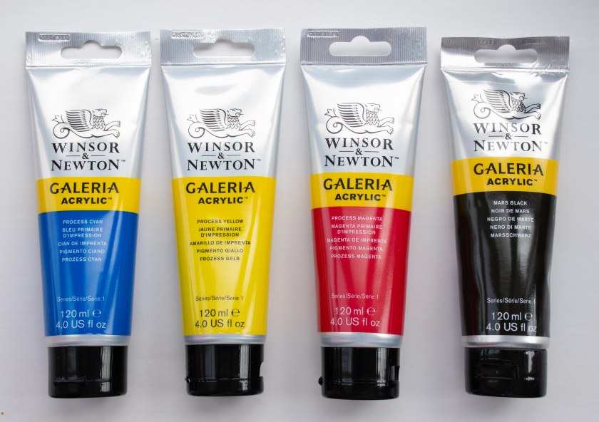
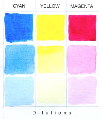
The acrylic paints that I found, are sold as “Process Cyan”, “Process Yellow” and “Process Magenta” by Winsor and Newton in their Galeria acrylic range. The “Process” refers, I understand, to the colours used in the “Printing Process”. At first sight, the Cyan looked darker than I had expected but a little dilution revealed the characteristic Cyan colour.
The colour fastness of these paints is provided by Winsor and Newton:
http://www.winsornewton.com/uk/discover/resources/composition-permanence/galeria-acrylic
All three of the “Process” pigments are given as Permanence = A; Lightfastness = I (ASTM) – which is excellent, so there should be no worries on that account.
The pigments shown on the tubes are: Cyan: PB15.3; PW6; Magenta: PV19; Yellow: PY74
The 120ml tubes (in the UK) cost £3.50 from Cowling & Wilcox.
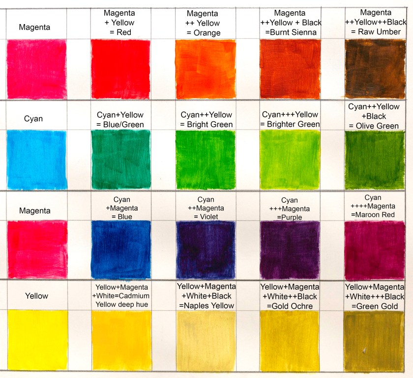
My first surprise was to find that the rules of colour mixing were different from RYB! For example, Red is made by mixing Magenta with a little Yellow.
Adding more yellow gives various shades of Orange and (very usefully) adding Black to this (I use Mars Black) produces all the earth colours from the Siennas to the Umbers. This use of Black was counter-intuitive for me as I have always been taught to avoid adding Black to mixes in the RYB system. But Black seems to be an essential part of using CMYK. I used Titanium white to give lighter tints where needed.
Blues are produced by mixing Cyan and Magenta and Greens by mixing Cyan and Yellow in various proportions.
This soon became easy to master – initially with a home-made chart at my elbow:
The results:
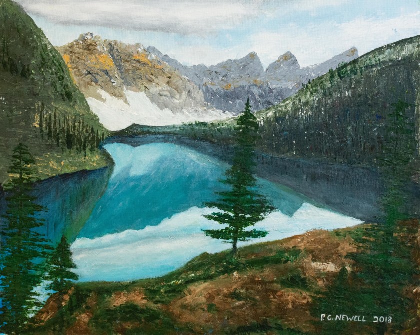
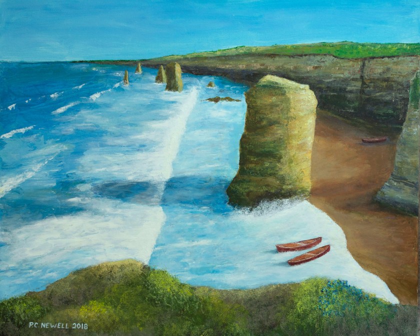
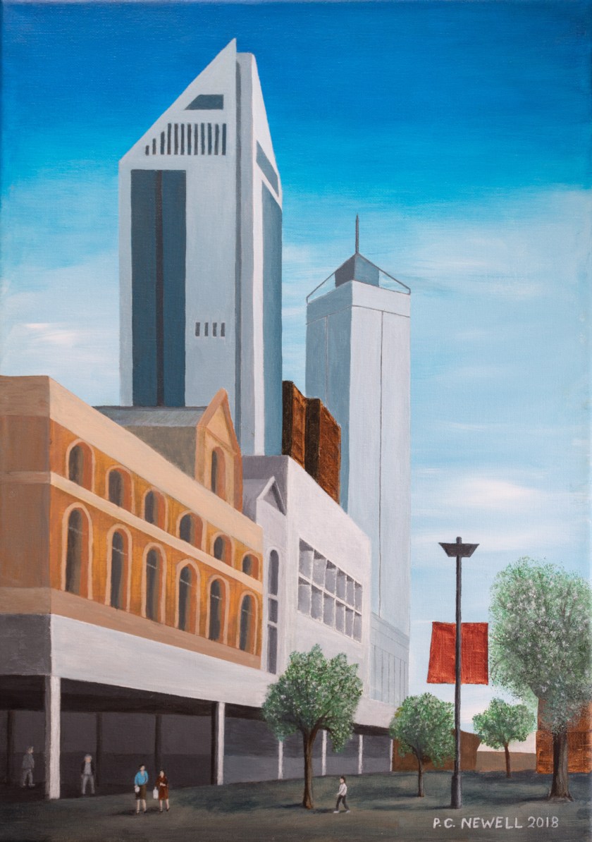
Three paintings that resulted are shown below. For all of them I used just the CMYK system pigments.
(Incidentally, as an exercise suggested by artist and tutor Sarah Moncrieff, – and for reasons unconnected with CMYK – I painted the first two with a palette knife, a sponge and other tools, but without using brushes).
Conclusion:
I’ll let readers judge the artwork for themselves but I can report that I was very happy with the practical aspects and outcome of painting with the the CMYK process paints.
The CMYK paints were not expensive and had a consistency that was easy to mix. I was very pleased with the range of colours that could be achieved and I felt no need to mix in other colours from my paint box. In fact, I was pleasantly surprised how straightforward it was to obtain the desired colours and (with a little practice) the subtle variations that could be produced!
I enjoyed the experience of using CMYK pigments and plan to do other paintings with this system – although I have no plans to throw away all the lovely (and expensive) paint colours in my paint box.
I would welcome any feedback about this experiment and would like to hear from any others who have tried out this (apparently unorthodox) system for their paintings.
Peter C Newell July 2018
Addendum:
CMYK painting in Oils
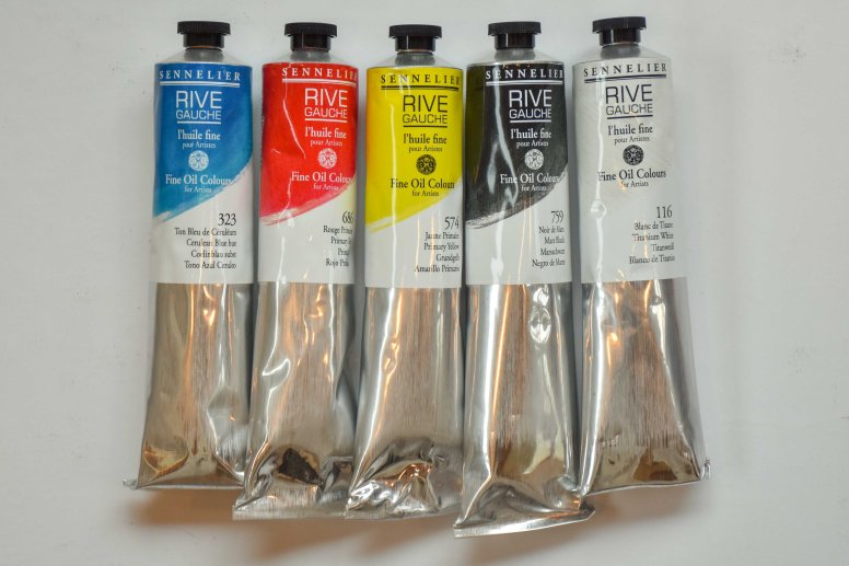
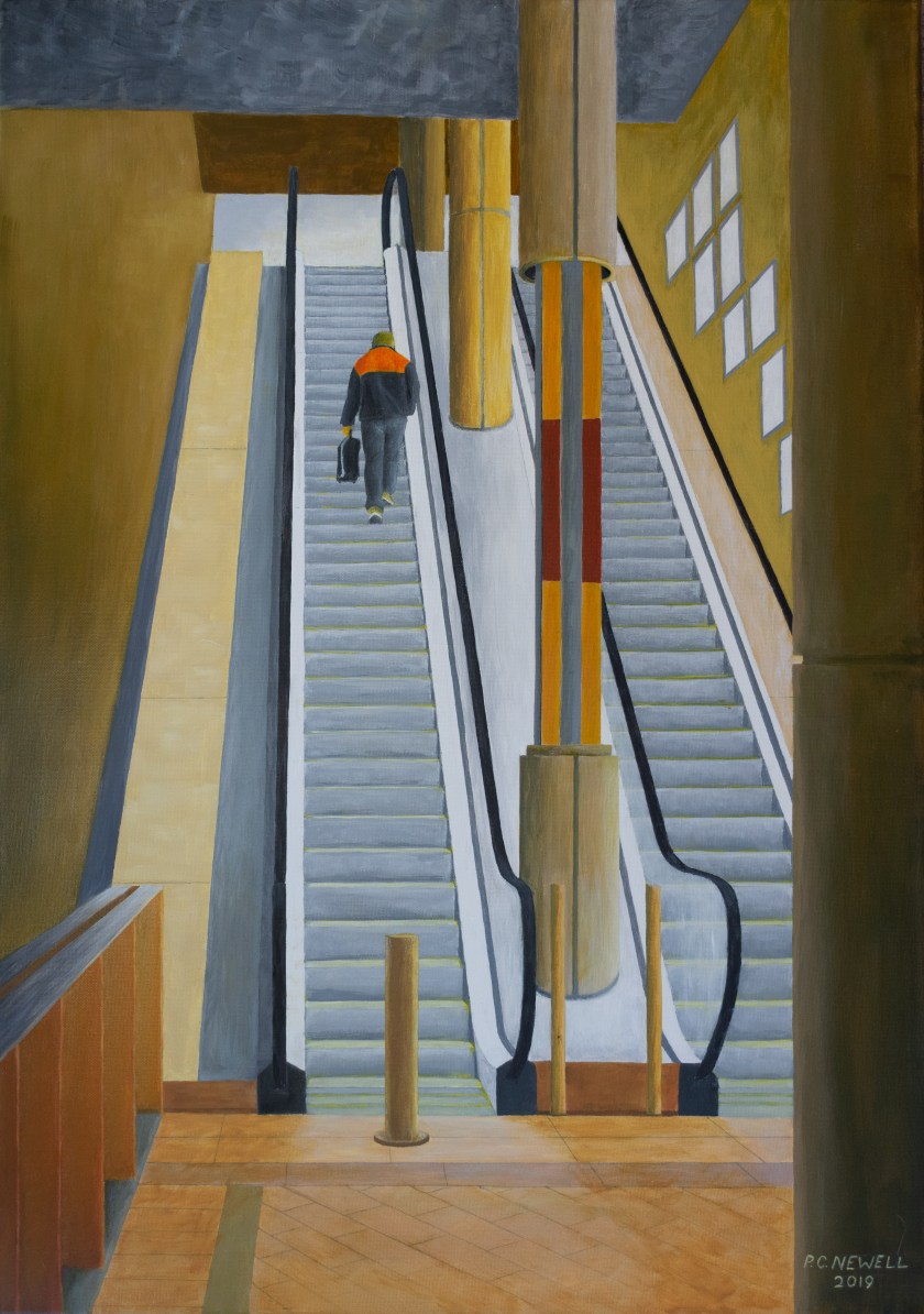
The CMYK painting system is not restricted to Acrylics but can also be used with Oil paints and Water Colours. For CMYK pigments in Oils I have found that Sennelier Rive Gauche paints work well and the same colour mixing system can be employed as described above for acrylics. These Rive Gauche paints also have the useful property of being touch dry in a couple of days. Oil paints allow better blending, which can sometimes be difficult with Acrylics. (For that reason I have found these oil paints to be useful for final over-painting of CMYK acrylic paintings to give a better blended effect – as in the escalator painting shown below).
The CMYK-equivalent colours I have used are:
For Cyan: Cerulean Blue hue 323
For Yellow: Primary Yellow 574
For Magenta: Primary Red 686
For Black: Mars Black 759 and
For White: Titanium White 116
CMYK painting in Water Colours
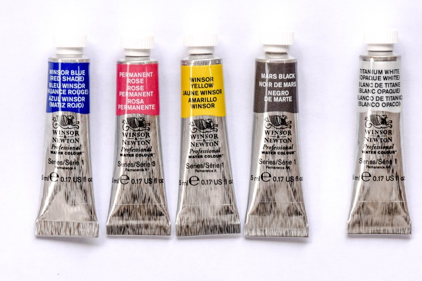
For CMYK Water Colour pigments I find the Winsor & Newton Professional Water Colours work well. The colour mixing system is the same as described for acrylics.
The equivalent CMYK colours I use are:
For Cyan: Winsor Blue (Red Shade)
For Yellow: Winsor Yellow
For Magenta: Permanent Rose
For Black: Mars Black and
For White: Titanium White
as shown below:
Peter C. Newell, January 2019
